Fed dot plot: How it works and its predictive power
 How the Fed dot plot works
On Tuesday, U.S. Treasury Secretary Scott Bessent stated that the White House intends to lower interest rates. According to Bessent, since Donald Trump took office, market expectations for rate cuts in 2025 have increased.
According to data from the CME Group's FedWatch Tool, which tracks derivative contracts speculating on Federal Reserve policy, investors now see three 0.25 percentage point rate cuts by the end of the year as the most likely scenario. This would bring the federal funds target rate down from 4.25-4.5% to 3.5-3.75%.
With markets preparing for rate cuts, investors are closely watching the Federal Reserve’s next move. But when and by how much will the Fed cut rates? One of the key forecasting tools for Fed decisions is the dot plot.
What is the Fed's dot plot?
The Federal Reserve publishes its economic projections four times a year, and one of the most crucial tools for understanding its future policy is the dot plot. This chart is part of the Summary of Economic Projections and illustrates each Fed member’s view on the appropriate interest rate levels for the coming years. However, can the dot plot be used as a precise indicator of future rate decisions? Partially yes, but with caveats.
The dot plot is a visual representation of forecasts from members of the Federal Open Market Committee (FOMC) regarding future interest rate levels. Each quarter, 19 Fed officials (FOMC members and regional Fed bank presidents) place a dot on the chart, indicating the interest rate they consider optimal by the end of the current and following years. The dots are anonymous, so it is impossible to identify which official made each forecast.
The dot plot provides insight into the consensus within the Fed, but it is important to understand that it is not a commitment—just an opinion that may change.
How to read and interpret the dot plot
Reading the dot plot is straightforward. Here’s an example of a dot plot published in June 2024:
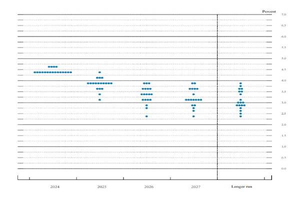
Source: Federal Reserve Board of Governors
- Columns: Each column represents a year, starting with the current year on the left. The last column is labeled as the long-term period, not a specific year.
- Rows: The rows represent different interest rate levels.
- Dots: Each dot represents a Fed official’s interest rate forecast for a specific year.
What does it mean?
The more dots clustered at a certain level, the higher the likelihood that rates will be set at that level. If most dots shift downward, it signals that the Fed is considering rate cuts. If the dots are widely spread, it suggests disagreements among policymakers, making future decisions harder to predict.
While the dot plot shows the Fed’s official projections, market expectations often differ. For example, investors are currently pricing in more aggressive rate cuts than the Fed has signaled. This is supported by the CME FedWatch Tool, which tracks rate expectations based on futures contracts.

Currently, Fed projections suggest a more cautious rate-cutting approach, whereas futures markets anticipate three to four cuts by the end of 2025. This divergence highlights that investors expect a more accommodative policy stance than the Fed is officially forecasting.
Can you trust the dot plot?
History shows that Fed forecasts often diverge from reality. In 2021, the Fed did not anticipate rapid rate hikes, yet by 2022, it launched the most aggressive tightening cycle in decades. In 2019, the dot plot projected gradual rate increases, but due to the pandemic, the Fed slashed rates to 0% almost immediately.
This confirms that while the dot plot is valuable, external factors must be considered for accurate interpretation:
- Inflation: If price growth remains high, the Fed may keep rates elevated for longer.
- Labor Market: Rising unemployment could prompt the Fed to ease monetary policy sooner.
- Global Risks: Economic crises or trade wars may accelerate rate cuts.
Conclusion
The Fed's dot plot is a useful tool for understanding policymakers' outlooks, but it does not provide guaranteed forecasts. Market participants may expect faster or slower rate changes depending on economic conditions. Additionally, FOMC members can adjust their forecasts as new economic data emerges, meaning the dot plot reflects current sentiment rather than definitive future actions.
Nevertheless, analyzing the dot plot helps investors gauge Fed discussions and anticipate potential monetary policy shifts.
In essence, the Fed's policies shape the financial landscape, influencing everything from stock markets to mortgage rates. Therefore, closely monitoring the central bank’s strategic moves offers a crucial advantage in navigating economic trends and adapting to changing market conditions.