The tweet was deleted by the author.
But we saved everything 🙂.


Steve Hou challenges the interpretation of a chart depicting economic regimes. According to Hou, the three sets of colored dots represent distinct periods, with the blue dots from 1958–81 reflecting an inflation-dominated era where the Fisher equation connects the 10-year yield and inflation.
View post on X Loading...
Hou has previously highlighted the U.S. debt-to-GDP ratio, noting that it is now about twice its 1990s level in recent comments. In another observation, he remarked that AAOI was in worse condition when first purchased, referencing improvement in company quality over time in an earlier article. These past remarks reflect Hou’s ongoing focus on historical financial data and its implications for current market assessments.



 Afghanistan
 Albania
 Algeria
 Angola
 Argentina
 Armenia
 Australia
 Austria
 Azerbaijan
 Bahamas
 Bahrain
 Bangladesh
 Belarus
 Belgium
 Bolivia
 Botswana
 Brazil
 Brunei
 Bulgaria
 Cambodia
 Cameroon
 Canada
 Chile
 China
 Colombia
 Congo
 Costa Rica
 Cote d'Ivoire
 Croatia
 Cuba
 Cyprus
 Czechia
 DR Congo
 Denmark
 Dominican Republic
 Ecuador
 Egypt
 El Salvador
 Estonia
 Eswatini
 Ethiopia
 Finland
 France
 Georgia
 Germany
 Ghana
 Greece
 Haiti
 Hong Kong
 Hungary
 India
 Indonesia
 Iran, Islamic republic
 Iraq
 Ireland
 Israel
 Italy
 Jamaica
 Japan
 Jordan
 Kazakhstan
 Kenya
 Korea
 Kuwait
 Kyrgyzstan
 Laos
 Latvia
 Lebanon
 Lesotho
 Libya
 Lithuania
 Luxembourg
 Madagascar
 Malaysia
 Malta
 Mauritius
 Mexico
 Moldova
 Mongolia
 Montenegro
 Morocco
 Mozambique
 Myanmar
 Namibia
 Nepal
 Netherlands
 New Zealand
 Nigeria
 North Macedonia
 Norway
 Oman
 Pakistan
 Palestine
 Panama
 Papua New Guinea
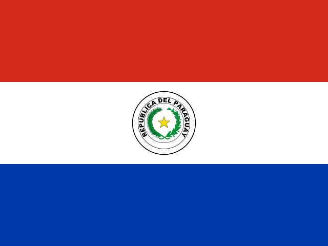 Paraguay
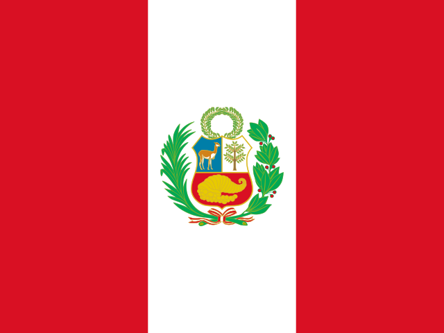 Peru
 Philippines
 Poland
 Portugal
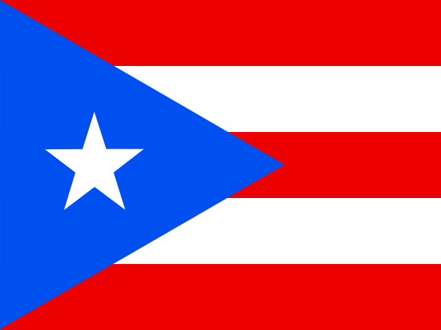 Puerto Rico
 Qatar
 Reunion
 Romania
 Rwanda
 Saudi Arabia
 Serbia
 Singapore
 Slovakia
 Slovenia
 Somalia
 South Africa
 Spain
 Sri Lanka
 Sweden
 Switzerland
 Syria
 Taiwan
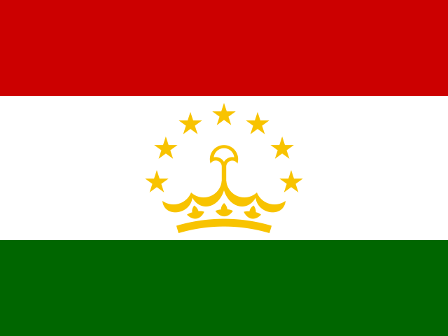 Tajikistan
 Tanzania
 Thailand
 Trinidad and Tobago
 Tunisia
 Turkey
 UAE
 Uganda
 Ukraine
 United Kingdom
United States
 Uruguay
 Uzbekistan
 Venezuela
 Vietnam
 Yemen
 Zambia
 Zimbabwe