The tweet was deleted by the author.
But we saved everything 🙂.

Few cryptocurrency symbols are as recognizable as Bitcoin’s distinctive orange emblem. Yet the design we know today wasn’t there when Bitcoin launched, and its origins are surprisingly unconventional. Who created it, and how did it become the face of a global cryptocurrency?
On November 1, Bitcoin’s famous orange logo turned 16. It first appeared in 2010, when the cryptocurrency was still an experiment developed by a small community of enthusiasts.
View post on X Loading...
The first Bitcoin logo was created by Satoshi Nakamoto, the cryptocurrency's mysterious founder. When the original software launched in January 2009, its icon showed a gold-colored coin with the letters BC in the center. The image resembled physical money, perhaps an understandable choice for introducing a currency that existed entirely online.

By early 2010, community members were debating whether Bitcoin needed a more distinctive symbol. Some suggested using the Thai baht sign, ฿, while others preferred something unique. The abbreviation BTC was also gaining support as an alternative to BC. Bitcoin was still developing its identity as a currency, and even its basic symbols had yet to be established.
On February 24, 2010, Satoshi presented a redesigned logo and asked for feedback. The gold coin remained, but BC was replaced by a capital B with two vertical strokes, resembling symbols used for established currencies. The familiar B had arrived, although its orange background was still months away.

The decisive change came on November 1, 2010, when a BitcoinTalk forum user named bitboy shared a collection of graphics. The contributor had taken Satoshi's double-stroked B and given it a new appearance, creating the design that would become Bitcoin's most recognizable image.
The gold coin was replaced by a flat orange circle, with the B rendered in white and tilted approximately 14 degrees clockwise. Its vertical strokes were adjusted to extend above and below the letter rather than passing through its center. The bright orange background, identified by the hexadecimal code #F7931A, helped the design stand out.
Bitboy's contribution went beyond the logo itself. The forum post included graphics suitable for websites, buttons, and promotional materials, giving supporters ready-made images to promote Bitcoin. The designer invited others to download and use the files freely. There was no formal competition or branding agency behind the project.
Interestingly, Bitboy acknowledged inspiration from established payment brands, particularly Mastercard and Visa. When another forum participant noticed the resemblance, the designer explained that familiar branding could help an unfamiliar currency gain acceptance:
“It is all about perception when it comes to consumer confidence and behaviour.”
The orange logo was simpler and more versatile than Satoshi's original designs. Its circular shape worked well as a small icon, while the white lettering remained visible against the bright background. The slight tilt made the symbol distinctive without sacrificing readability.
Equally important was how easily the design could spread. Bitcoin had no central marketing department deciding which logo businesses should use. Instead, wallet developers, exchanges, merchants, and community members could incorporate the graphics into their products. As more services adopted the orange ₿, it became increasingly familiar.
The logo eventually moved beyond computer screens. Bitcoin ATMs, payment stickers, conference banners, and merchandise helped make it recognizable even to people who had never owned cryptocurrency. Its appearance in financial news and advertising further strengthened that recognition.
There is also a difference between Bitcoin's logo and its currency symbol. The orange circle serves as a visual identity, while ₿ represents Bitcoin in written text, much as $ represents the U.S. dollar. In June 2017, the symbol was added to Unicode, allowing it to appear in documents and software as a standardized character rather than an image.An unlikely legacyThe person behind the Bitboy username has never been publicly identified with certainty. While Satoshi Nakamoto's identity has inspired countless investigations and theories, the designer responsible for one of the world's most recognizable financial symbols has largely escaped public attention.
There is an interesting contrast here. Bitcoin has evolved from an obscure experiment into a major financial asset, attracting institutional investors, regulators, and governments. Its logo, meanwhile, has remained virtually unchanged since 2010.



 Afghanistan
 Albania
 Algeria
 Angola
 Argentina
 Armenia
 Australia
 Austria
 Azerbaijan
 Bahamas
 Bahrain
 Bangladesh
 Belarus
 Belgium
 Bolivia
 Botswana
 Brazil
 Brunei
 Bulgaria
 Cambodia
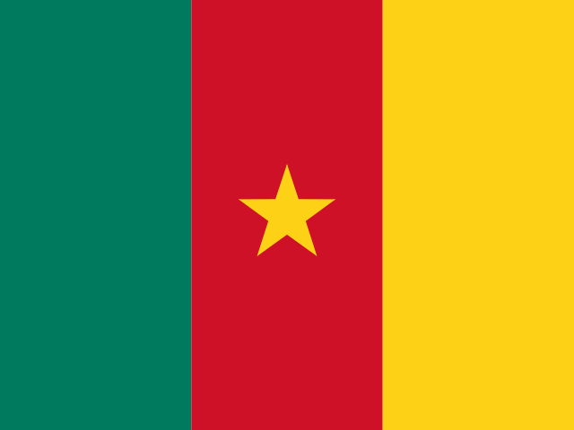 Cameroon
 Canada
 Chile
 China
 Colombia
 Congo
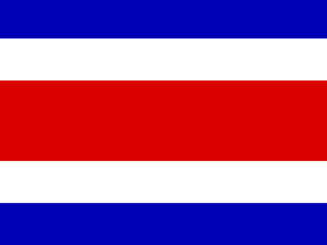 Costa Rica
 Cote d'Ivoire
 Croatia
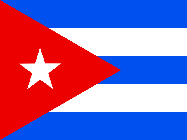 Cuba
 Cyprus
 Czechia
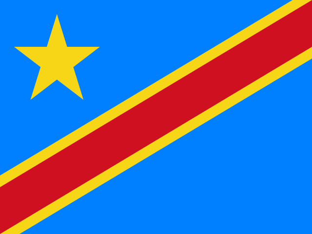 DR Congo
 Denmark
 Dominican Republic
 Ecuador
 Egypt
 El Salvador
 Estonia
 Eswatini
 Ethiopia
 Finland
 France
 Georgia
 Germany
 Ghana
 Greece
 Haiti
 Hong Kong
 Hungary
 India
 Indonesia
 Iran, Islamic republic
 Iraq
 Ireland
 Israel
 Italy
 Jamaica
 Japan
 Jordan
 Kazakhstan
 Kenya
 Korea
 Kuwait
 Kyrgyzstan
 Laos
 Latvia
 Lebanon
 Lesotho
 Libya
 Lithuania
 Luxembourg
 Madagascar
 Malaysia
 Malta
 Mauritius
 Mexico
 Moldova
 Mongolia
 Montenegro
 Morocco
 Mozambique
 Myanmar
 Namibia
 Nepal
 Netherlands
 New Zealand
 Nigeria
 North Macedonia
 Norway
 Oman
 Pakistan
 Palestine
 Panama
 Papua New Guinea
 Paraguay
 Peru
 Philippines
 Poland
 Portugal
 Puerto Rico
 Qatar
 Reunion
 Romania
 Rwanda
 Saudi Arabia
 Serbia
 Singapore
 Slovakia
 Slovenia
 Somalia
 South Africa
 Spain
 Sri Lanka
 Sweden
 Switzerland
 Syria
 Taiwan
 Tajikistan
 Tanzania
 Thailand
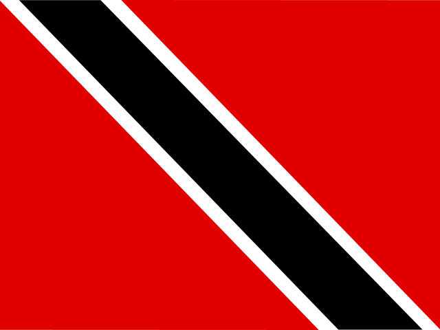 Trinidad and Tobago
 Tunisia
 Turkey
 UAE
 Uganda
 Ukraine
 United Kingdom
United States
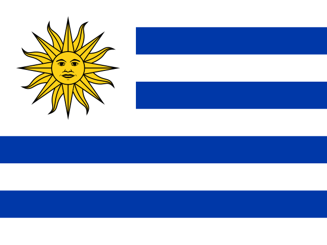 Uruguay
 Uzbekistan
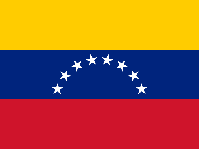 Venezuela
 Vietnam
 Yemen
 Zambia
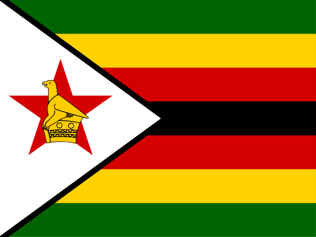 Zimbabwe